Designer Spotlight: Melissa Warner of MWM
Previously, I spotlighted the very talented design trio at Massucco Warner and Miller Interior Design and Decoration. Today I'm excited to be featuring one of the latest projects by the lovely Melissa Warner, head of the Los Angeles office. Melissa sent me photographs of a San Francisco home she recently finished for a young family. I was absolutely delighted to receive them in my inbox! I think you'll see why...

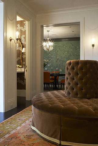
Entry

Dining Room
How great are these tangerine velvet chairs?!? They work so beautifully with the De Gournay Portobello wallpaper.

This clean, uncluttered, light-filled office, with just the right amount of kelly green imperial trellis added for style, makes it an ideal work space.

Who knew office cabinets could be so glam?
 Living Room
I love that these chairs are upholstered in an unexpected color -it's such a fun way to take something traditional and make it more modern

Such amazing light! who wouldn't want to spend their mornings there?

Family Room

I love the impact bold painted stripes can make.

Girl's Room

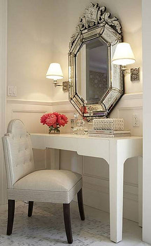
Master Dressing Room

A perfect composition of simple and standout pieces {that mirror}!

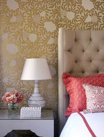
Master Bedroom
Osbourne and Little Asuka wallpaper + plush tufted headboard + crisp bedding = bedroom perfection

I was lucky enough to do a little Q&A with Melissa. Here's what she had to say about the design project:
AB: What was the goal of the project?
M: A fresh take on the classic! The goal was to reinvent the traditional with clever details, bold patterns, and color for miles. I wanted to make the home functional and kid friendly, while maintaining a hip vibe and uniqueness that reflects the personality and youthfulness of its owners.
AB: Where did you find inspiration?
M: The clients! This young family is filled with energy and I wanted to make sure the house represented their lifestyle.
AB: What was your biggest challenge?
M: Using kid friendly fabrics without sacrificing style!
AB: What was your favorite design resource you used?
M: I worked with a local upholster who was so patient with me as we worked out every detail of tufting, nailheads, welting...the list goes on and on. I really enjoyed working with him to customize each piece and make it one of a kind.
AB: Which was your favorite room and why?
M: That's a tough one but I'd have to say the little girl's room! I had so much fun designing each detail of this space... I can't resist the turquoise and watermelon combination.
AB: Did you have to make any big compromises?
M: The client was a dream! Our visions for the space were so consistent so I didn't have to make any big compromises.
AB: Did you use any inexpensive pieces?
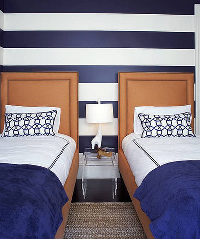
M: We did definitely mix and match higher end pieces with less expensive items. In the little boy's room, the beds are custom made but we paired them with lucite nesting tables from CB2 -a reasonably priced and chic solution!
Take the Guesswork Out of Deciding What Size Pillows to Get
Sign up to receive our free illustrated Cheat Sheets - they're a handy reference for determining the best pillow sizes for various sofa and bed sizes.


